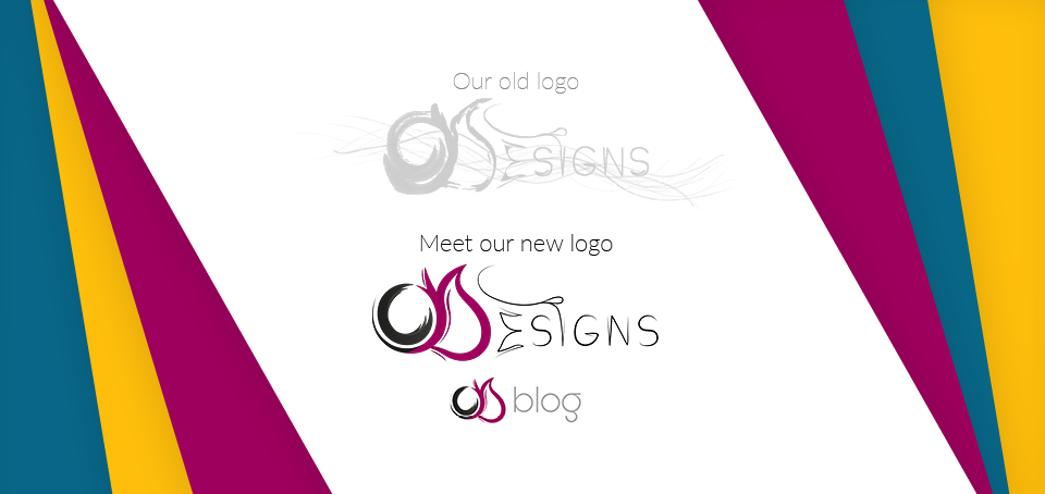
The changing of our logo is the newest thing we have done with the internet company, OhYeahDesigns. We are proud to present to you our logo redesign.
The “why” of our logo redesign
We have liked our own logo since day 1. After it was completed, we were in love with its colors, modernity and all the swoosh-style lines it had with it; however, it had one simple flaw (if we would dare to admit this is the right word). It wasn’t modern enough for our eyes. So we decided we should change it a little bit in order to make it a bit more modernized. It’s more simple, more eye-catching and lovely. At least, that’s what our folks have agreed upon.
Logos should not really change in the course of time, but, then again, we felt like it and did change it a bit. We hope that you like it too.
The “how” of our logo redesign
So how do we decide if this is more modern? Well, there are practically infinite number of designs over the internet. Since day one when OhYeahDesigns came to be in late 2014, we have tried to keep up with the beautiful minds of designers all over the world. There is always a vast variety of beauty all around the web, and in the real world.
There is no denying the fact that, once inspired, you can’t limit yourself to anything, really. The creative minds here at OhYeahDesigns have always participated with each other in great debates over the current trends of all times. We are not going to bore you with more details. The final design of the new logo just captured a lot of what is not called the modern era of simplicity and creativity.
The “others”
All over the world, famous brands have made changes to their logos, at least once or twice. Just Google the phrase “famous rebrands” and you will be provided with a list of a big number of companies who have made their logos “simpler”. It’s because, with the fast growing number of businesses all around us, we, humans, have a tendency to go with what we can recall easily when making a purchase, visiting a store, choosing a bank, ….
The first thing we look for in a brand is their promise to add value to our life for a better price. The companies that are truthful in their efforts catch us in a glimpse of a look, and that’s that. The next step for them would be to make us remember them more easily. Some of them have really simple names. “Apple” for example is a simple name. After everyone saw and accepted in their minds what Apple Computers was,
Apple simply omitted the second part and simply went “Apple”. Now, at every corner of the world, when we talk about an Apple wallpaper, a really small number of people will associate with a wallpaper of a real apple (which is edible).
Apple is just an example. Companies are looking for ways to brand themselves in a way that they will be better and more easily perceived by their target market.
The “final words”
Changing our logo was not a simple decision; however, after all of us here saw the new logo, which is really a better version of the previous one, we were awed. We hope that you get to like our new logo, too. Thanks for reading!


Leave a Reply